Building a rewards platform to encourage employee activity and healthier habits
Ucando-it Employee Wellbeing
Case study UX/UI WEB APP
Employer
Novacroft
Role
UX/UI, Creative Direction and Lead Design
Overview
UcanDo-It was a rewards platform designed to encourage employees to be more active and support healthier lifestyles.
I designed the product experience across web and mobile, focusing on making activity tracking, rewards and challenges easy for employees to understand and participate in.
The platform helped Novacroft and pilot partner Virgin Trains run wellbeing initiatives that motivate staff to stay active while giving employers better visibility of engagement and participation.
Context and problem
Novacroft wanted to explore a new product offering focused on employee wellbeing, with Virgin Trains acting as an early partner and pilot customer.
The idea was to design a platform that worked for inactive or low activity employees, encouraging small but consistent improvements rather than intense fitness programmes and earn points that can be converted to rewards.
An MVP approach was agreed, with automatic activity tracking via the Moves app as the primary integration, and Strava included if time allowed.
The platform needed to support:
Everyday movement like walking
Team based engagement and visibility
Events, challenges and rewards
Employer level management and reporting
Goals
1
Encourage regular physical activity and participation without adding friction
2
Support automatic activity tracking via third party services
3
Allow users to set their own movement goals
4
Make progress and activity visible at both individual and team level
5
Provide a simple admin interface for managing users, teams, and events
6
Design an MVP that could be tested and iterated quickly
Research and insights
Research focused on understanding how employees engaged with wellbeing tools in real life, not ideal scenarios.
Insights were gathered through early prototypes and direct user feedback from various workshops.
Key insights included:
The audience was inactive employees, not fitness enthusiasts
Manual input caused drop off. Automatic tracking was essential
Simple goals and clear progress mattered more than rewards alone
Gamification and light social visibility helped keep people engaged
Key decisions
Based on the research, I made a number of deliberate design decisions.
Key decisions I made included:
Keeping the interface simple, colourful and approachable, avoiding the serious, performance led tone typical of fitness apps.
Using illustration to create a lighter, more human feel and reduce any sense of pressure or intimidation.
Designing around encouragement and visible progress rather than targets and comparison.
Making screens quick to read and rewarding at a glance, with as little friction as possible.
Design work
I designed the end-to-end experience across the platform, from initial onboarding through to daily use and admin management.
What I delivered:
User journey mapping to define core flows and edge cases
Workshops with stakeholders to align on scope, constraints and priorities
Early wireframes and prototypes used to test ideas and validate flows
Full UI design for the employee experience, covering onboarding, activity tracking, goals, events and rewards
UI design for the admin platform to manage users, teams and events
Illustrations where needed to support a lighter, more approachable tone
User journeys
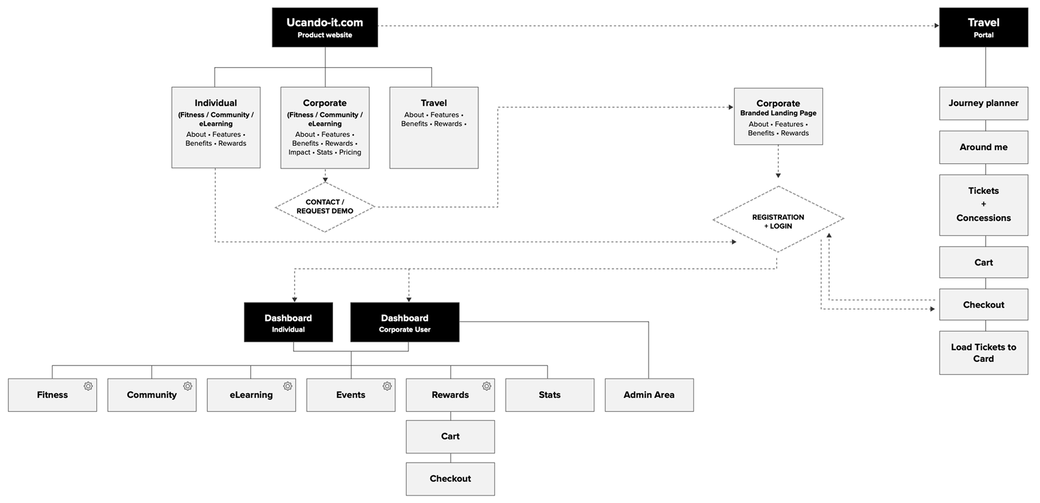
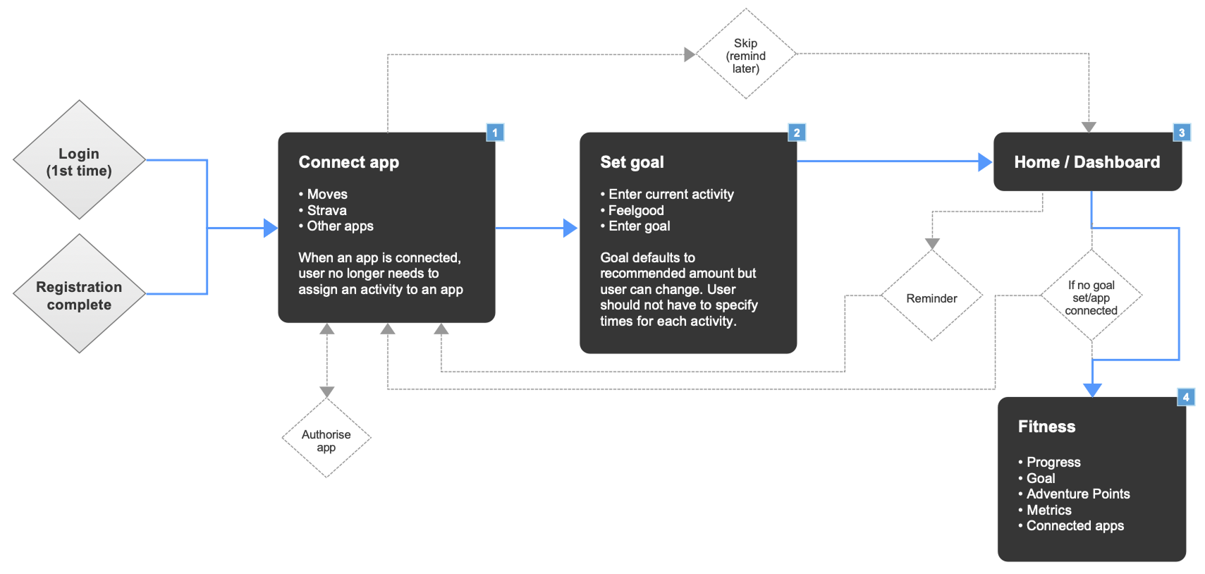
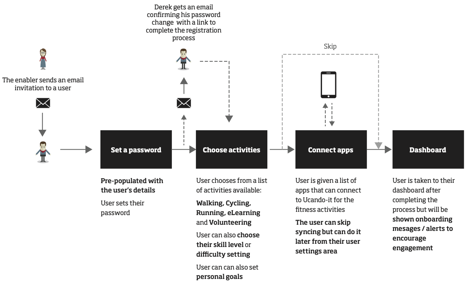
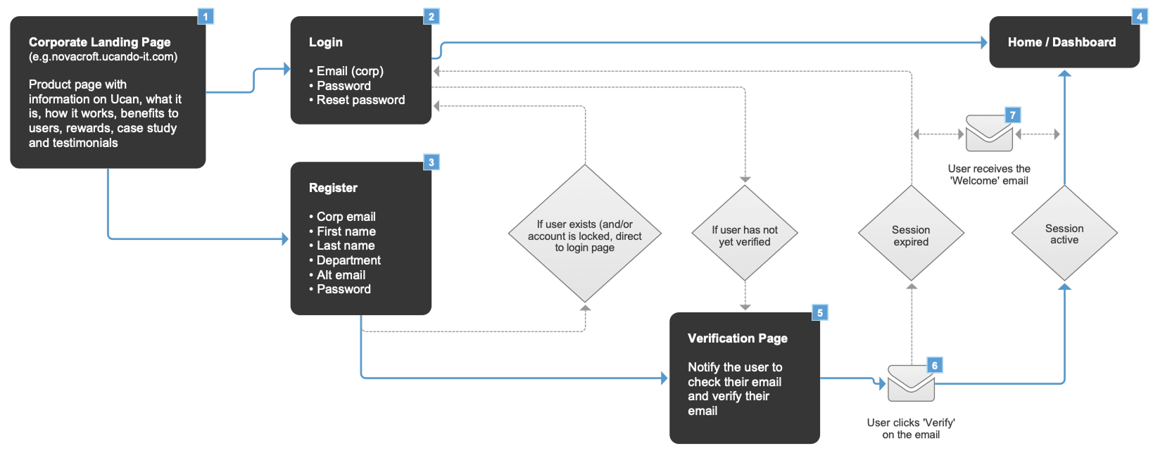
Examples of key user journeys used to explore onboarding, activity tracking and rewards.
System overview: How the product, dashboards and admin tools connect end to end.
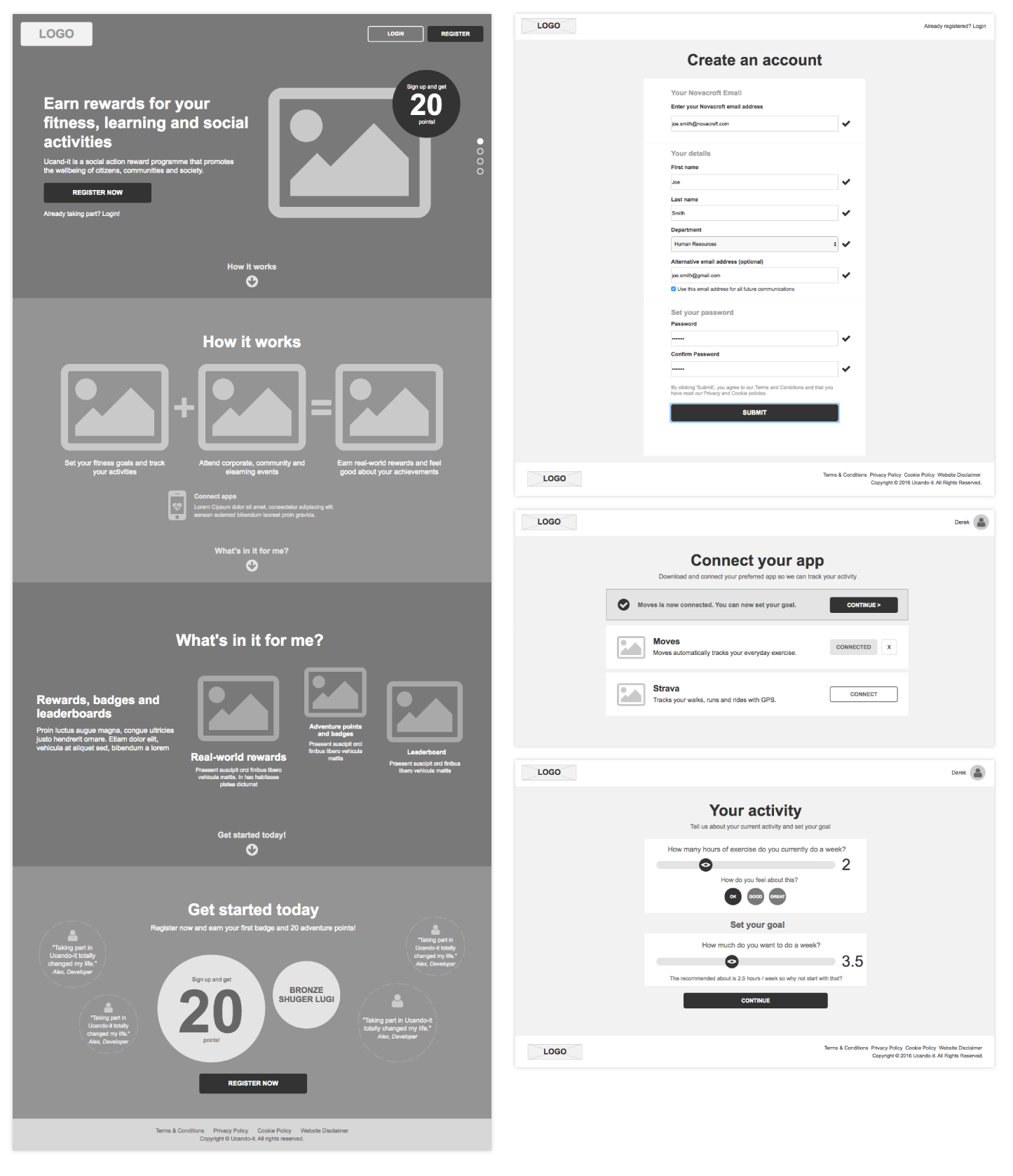
First-time setup: Connect apps, set a goal and see progress.
User onboarding: From invite to dashboard, keeping setup quick and getting users moving.
Registration flow: Corporate signup and verification.
Wireframes
Core journeys and structure were worked through in detail using early wireframes, tested quickly and refined into mid-fidelity designs before moving into full UI.
Early wireframes: Exploring core journeys and validating flows early.
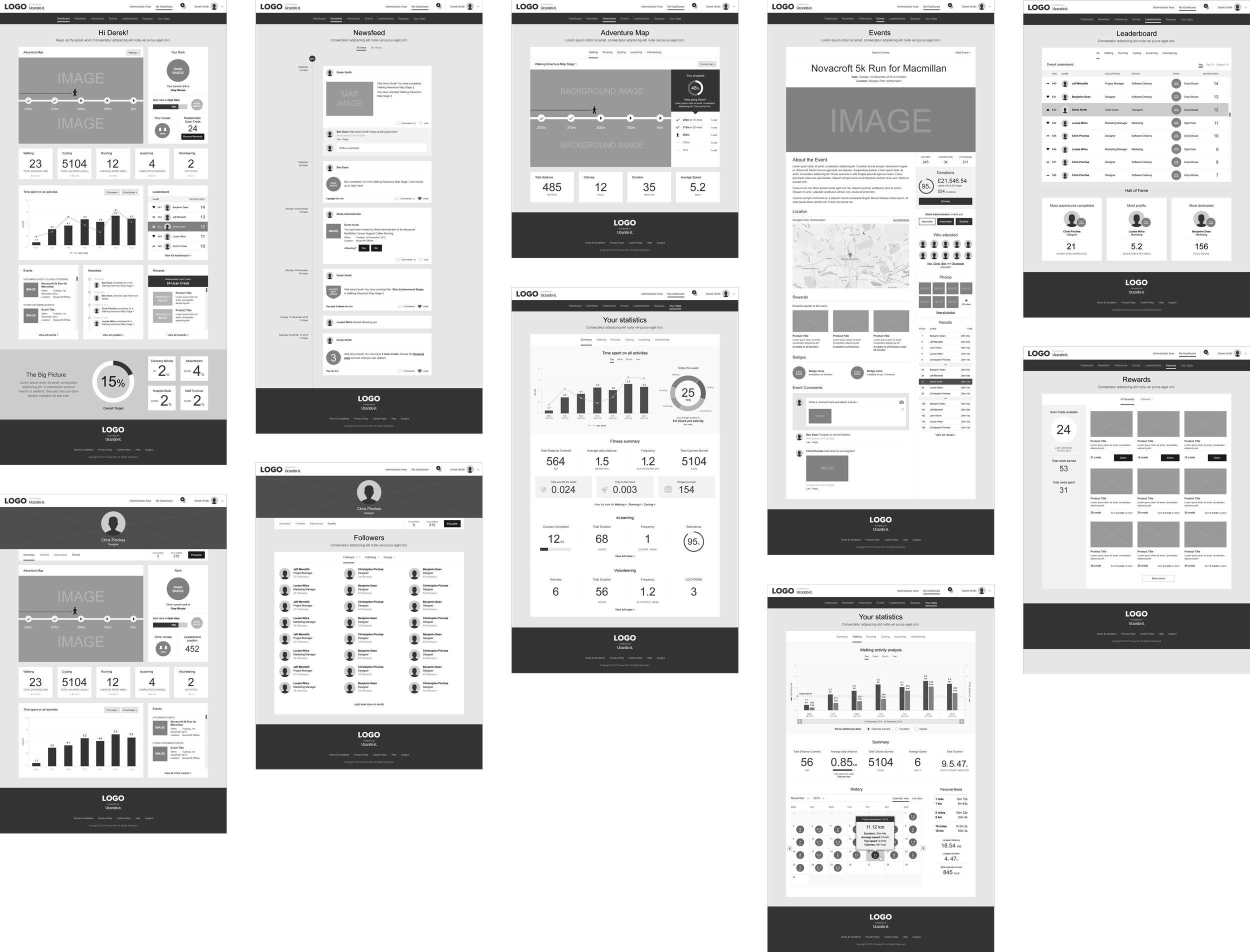
Refined wireframes: Core journeys developed into mid-fidelity screens once structure and flows were validated.
UI designs
Final interface designs showing onboarding, goal setting and app connections, with a light-hearted visual style to keep the experience approachable.
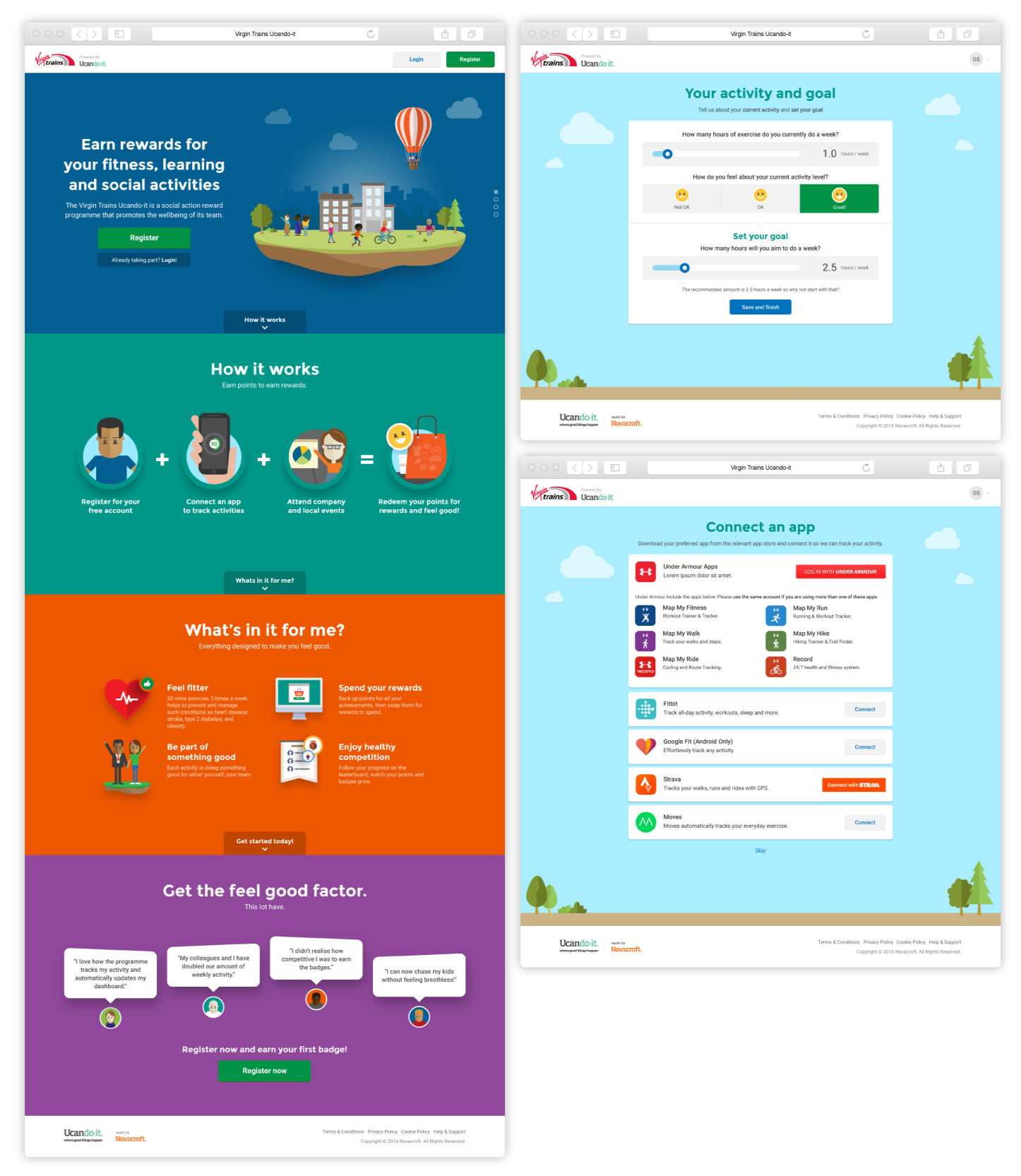
Main website and user registration
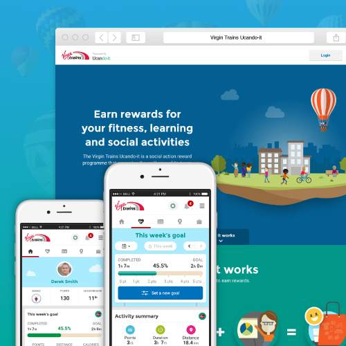
Landing page introducing the programme alongside key onboarding screens for setting activity goals and connecting third-party tracking apps.
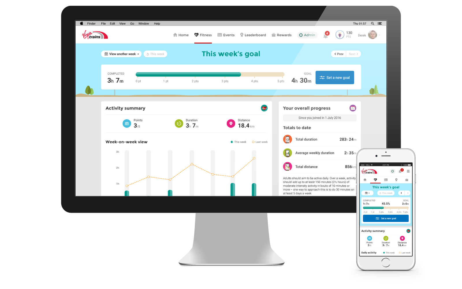
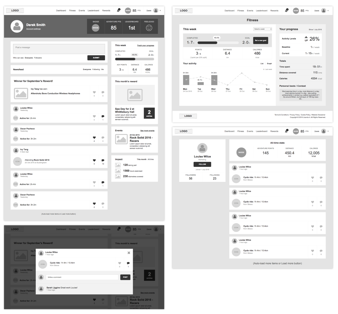
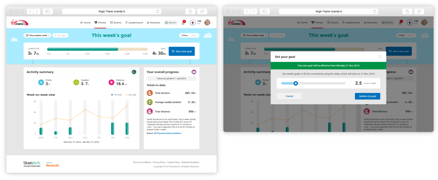
Dashboard and goal setting
The main dashboard showing weekly progress and stats, with a simple modal flow to review and update personal activity goals.
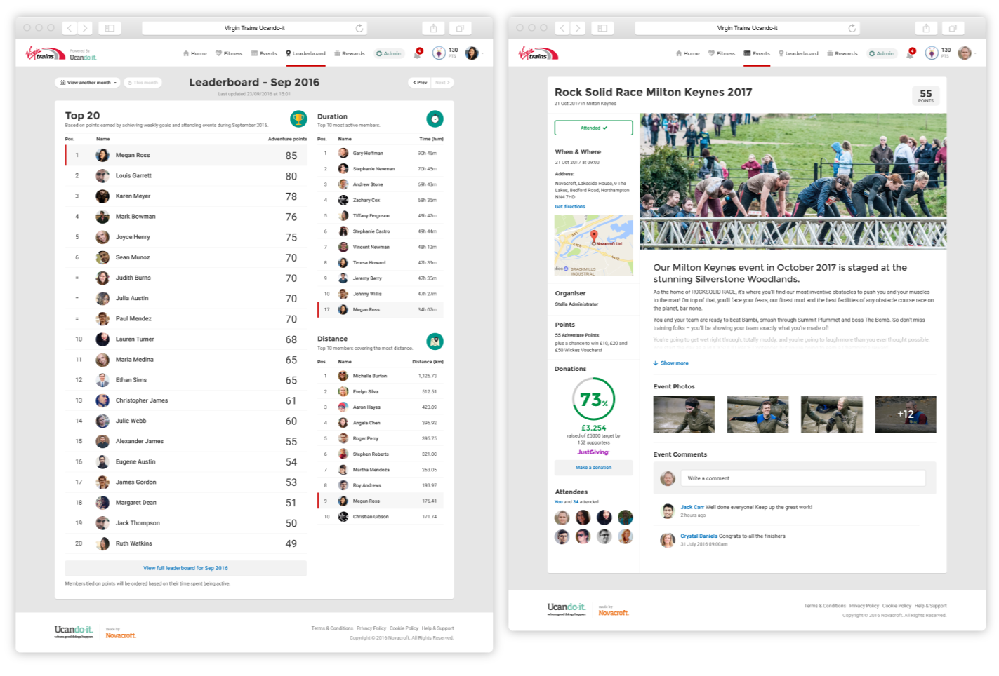
Leaderboards and events
Competitive team leaderboards to encourage friendly motivation, alongside event pages showing details, participation, points earned and social interaction.
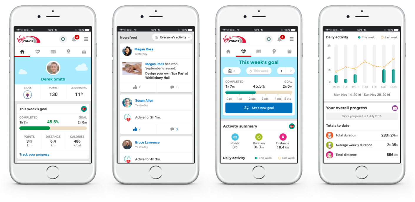
Mobile experience
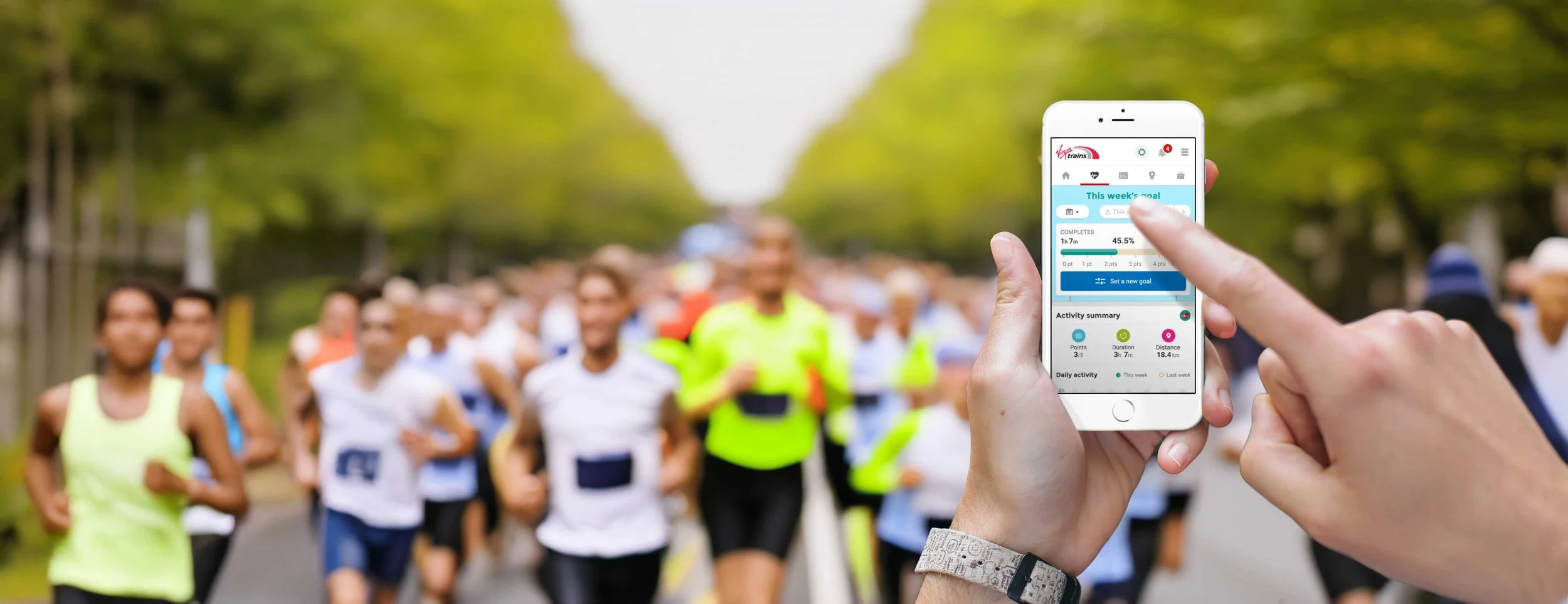
A companion mobile view showing personal progress, weekly goals, activity feeds and stats, designed for quick check-ins rather than heavy interaction.
Outcomes and learnings
The pilot showed that a simple, low-friction wellbeing product could drive behaviour change without feeling like a fitness app.
1
Activity increased through simplicity
Making setup and tracking easy helped users stay active, increasing weekly activity by around 1.5 hours.
2
Visible progress drove engagement
Clear goals, stats and team activity kept users motivated beyond just earning rewards.
3
The pilot proved real value
Early results showed reduced absence and a £4.50 return for every £1 invested, supporting further rollout.
Learnings
Getting the structure right early paid off. Spending time on journeys and flow upfront meant the UI stage moved quickly and changes were easier to absorb.
Tone and visual style matter more than expected. A friendly, light-hearted interface lowered the barrier to entry and made the product feel approachable to people who wouldn’t normally engage with wellbeing tools.
Taking part in the programme myself helped validate design decisions in real use, making it easier to spot friction, test assumptions, and judge whether the experience genuinely supported daily habits.
More work
-
![Weatherbys ePassport]()
Weatherbys ePassport
CASE STUDY UX / UI APP
-
![Travis Perkins Price Hub]()
Travis Perkins Price Hub
CASE STUDY UX/UI ENTERPRISE
-
![]()
Wetherspoon Order & Pay
UX/UI APP
-
![MyJDW App]()
MyJDW App
UI APP
-
![House of Garrard]()
House of Garrard
UX/UI eCOMMERCE
-
![Wetherspoon Allergen Kiosk]()
Wetherspoon Allergen Kiosk
UX/UI KIOSK
-
![Inside Out Community]()
Inside Out Community
UX/UI WEB
-
![D&AD Community Portal]()
D&AD Community Portal
UI WEB
-
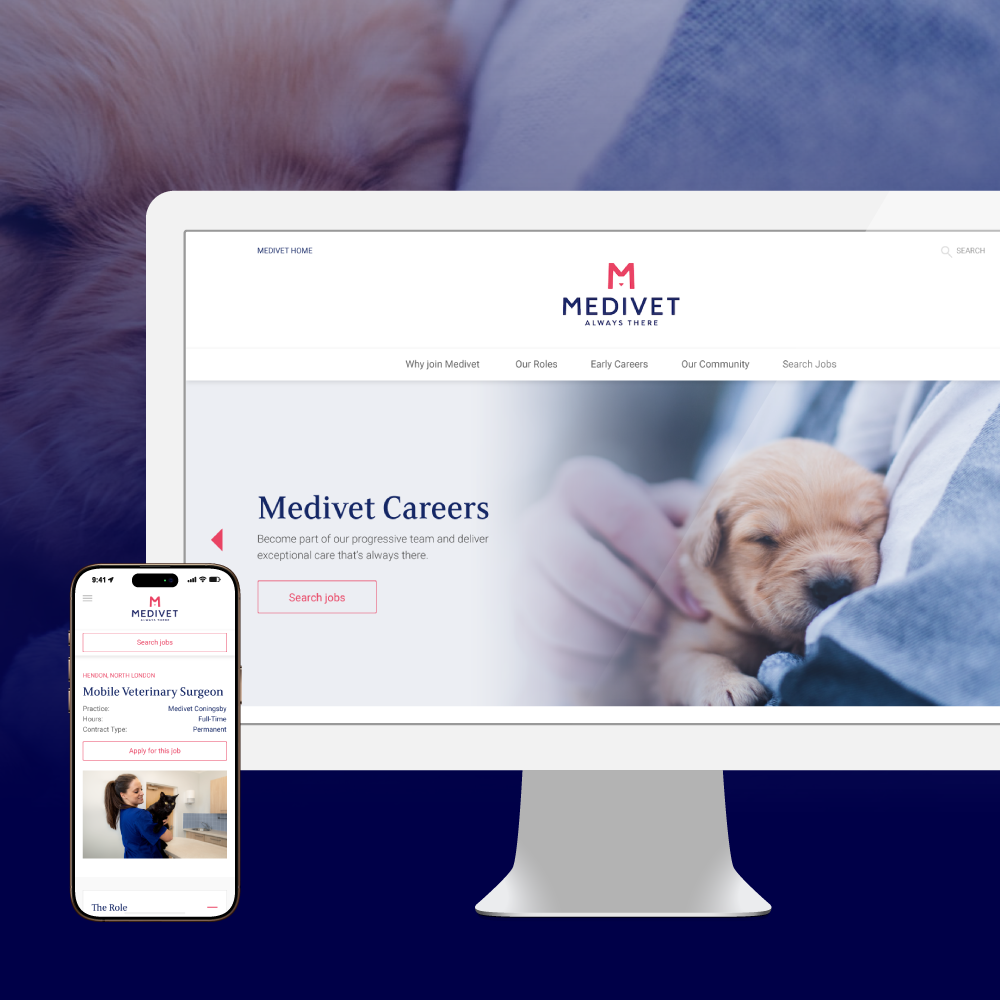
![Medivet Careers]()
Medivet Careers
UI WEB
-
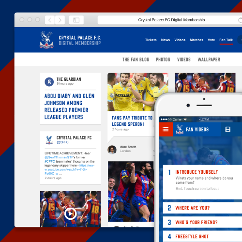
![Crystal Palace FC Members]()
Crystal Palace FC Members
UX/UI WEB
-
![]()
Ucando-it Employee Wellbeing
CASE STUDY UX/UI APP WEB